This is my design journey
Hi! I'm Etta.I’m evolving as a UI designer — moving from words to imagery, and from static graphics to meaningful interactive experiences — while stepping toward where my heart truly belongs.
interactive
UX/UI Projects
Honing my problem-solving skills through crafting visually appealing and user-centered digital interfaces for businesses.
graphics
Print Design
The seeds of creativity were planted deep within me, sprouting through early design projects for friends and freelance endeavors.
© 2026 Etta Kwok. All right reserved.
UX/UI Design Projects

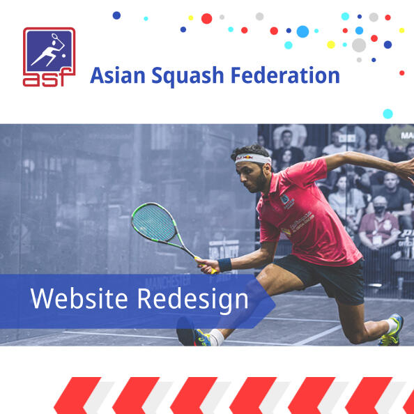
ASF Website redesign

Furriends Clinic App

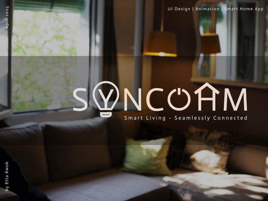
Syncohm Smart Home App

Soleful Online Shoe Store


Print Design
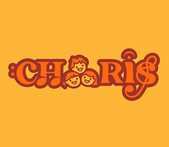
Children's Choir Logo - Charis, means "grace", "life".
Vocal Studio Wall Fixture - 3D acrylic brand mounted on wall

Concert Poster - developed on creative shots

Concert Program Card - combines a brief rundown, acknowledgement message and a QR code for detailed house program download

Class Promote Leaflet

Magazine layout (Playtimes - a bilingual parental magazine)

New Year Couplets for Quaker products

Digital leaflet for a luthier's studio

Concert Poster
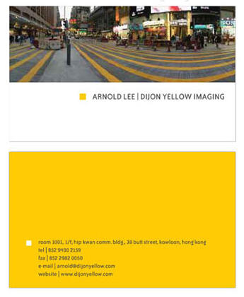
Business Card
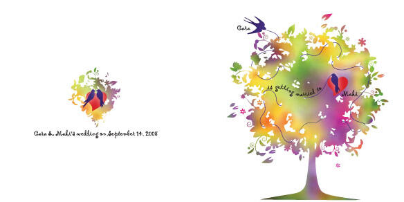
Wedding Invitation

Digital invitation


UX/UI Design Projects
Asian Squash Federation - website redesign

OBJECTIVE
The redesign of a sports association’s website was led by a Hong Kong-based IT agency. The client wanted a fresh, modern look while preserving their established brand identity.
I was the UI Designer for this project.
PROCESS
After reviewing the existing website, I’ve proposed several structural UX fixes and a design direction. Then by the agency’s request, an initial layout draft with detailed main visual elements was handed in soon. This process took only a couple months. The website was later revamped by the agency without my further involvement however.
Leaning down the visuals
Highlighted photos are displayed in a carousel, instead of a long line of thumbnails.
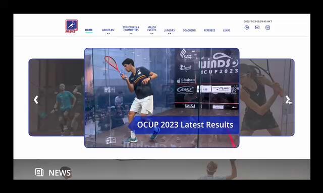
Abstract of news keeps the Home page clean and improves the readibility of the entire screen. Text overloading is avoided.

Problem solved: Enhanced eligibility and clarity.
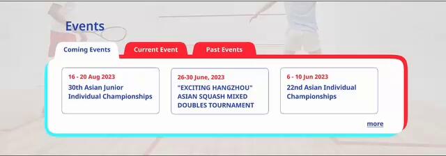
Organised event lists
Event links organised by either tabs or year index avoid long scrolling.
Problem solved: Long event listings

Past Events


Members list

Smart indexing splits long scrolling
Event links can be easily found without scrolling up and down, organised with either tabs or year index.
Problem solved: Long listings of members
More innovative visuals
Subtle motion graphics and colours enhance the website’s sense of interactivity and responsiveness.
OUTCOME
The final website was built using the agency’s own template, which limited the flexibility of the layout across all screens. Some details still need fine-tuning.That said, the main visual elements are applied to the current web design. Several of my suggested UX fixes were implemented and have proven effective in improving the user flow — although the final design differs from my original proposal.